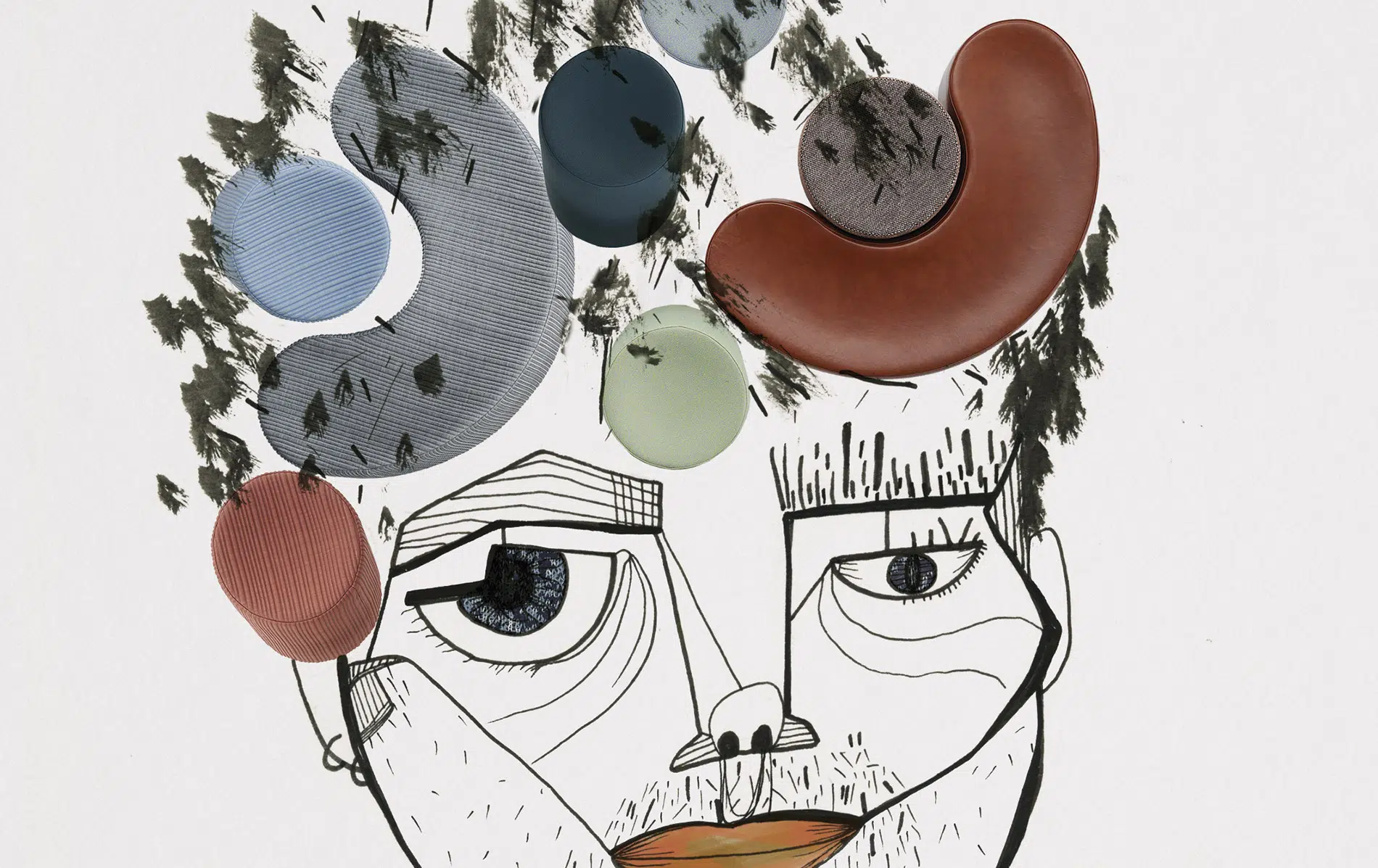
From a simple black and white graphic silhouette to a colourful Totem.
As a teenager, Sylvain Willenz began scribbling comics as he wanted to be a cartoonist. His wish was to create something that would come to life, something he could use and live with. At this point he discovered industrial design, a discipline in which he could apply his passion for drawing.
The paper is pierced by his sketches, resulting in clean and simple designs with a subtle graphic touch. An elegant and timeless style in which materials take on special relevance. And of course, he has also transferred it to textile design.

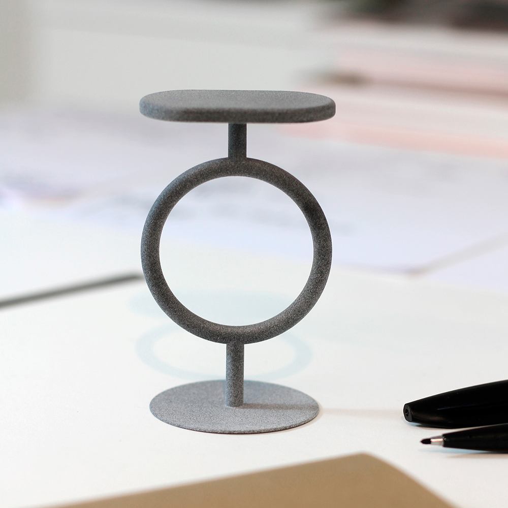
Totem is Sylvain’s first collaboration with Sancal and his style can be clearly seen in it as this design seems to be sketched on a blank piece of paper on which he draws a straight line and a circle. With this basic lines he formally reduces the archetype of a stool. Its defined, clear lines transcend beyond its use as a stool to become a sculptural decorative object.
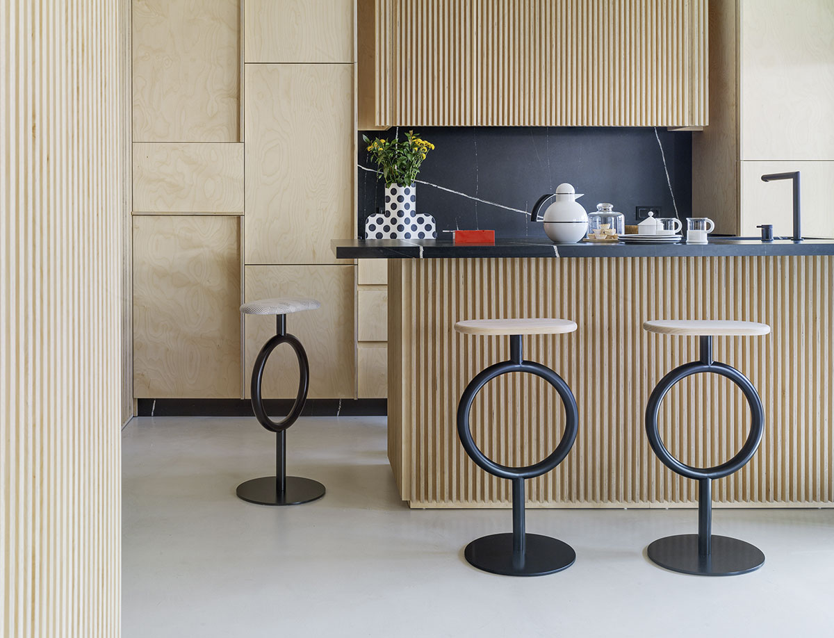
In addition to its use in domestic and restaurant projects, Totem can also be found in retail spaces, clinics, or offices. Let’s visit the selection of inspirational projects.
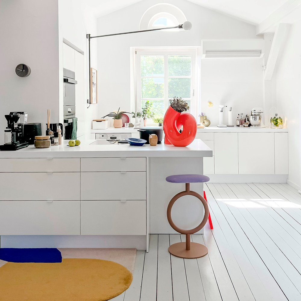
Lilli Grewe’s home.
This house is full of details that make it a very special place for Lilli and her family. Her kitchen is spacious and bright, and the white colour chosen for the surfaces of this space emphasises this feeling. The touch of colour is provided by the Totem stool with a nude base and lilac upholstered seat. You can visit her home from her instagram profile @kitschcanmakeyourich.
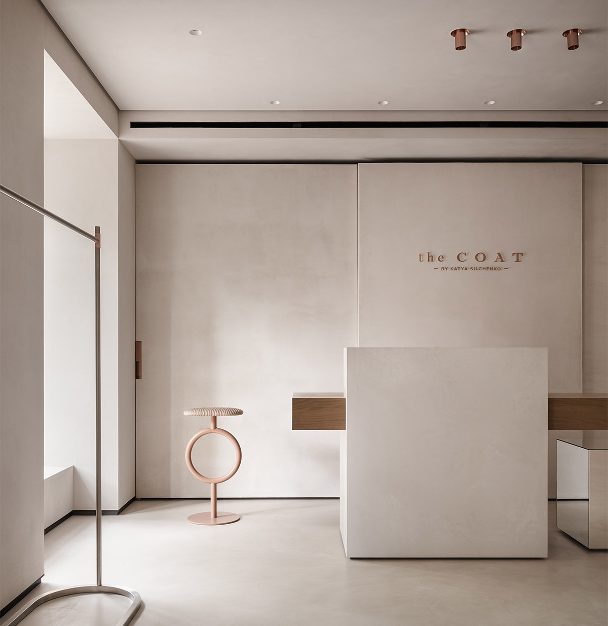
The Coat by Katia Sylchenko
The interior of this pret a porter shop is minimalist but really expressive. Neutral colours and materials give continuity to an elegant and demure space in which the Totem stool in nude tones is delicately integrated. Here you can see this project. De Rina Lovko. Imágenes de Yevhenii Avramenko.
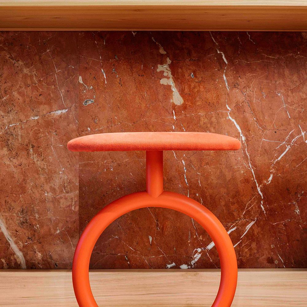
Niche Co-working by Martina Fenech-Adami.
This elegant space designed by Martina was an opportunity to create a co-working hub for the creative community. The designer combined the concept of a home away from home, but with the ambience of a café. Thus, she has created a social and welcoming atmosphere. The Totem stools are a colourful accent to a bar where you can not only work but also chat. A project by Niche Studio by Martina Fenech-Adami. Images by Ramon Portelli.

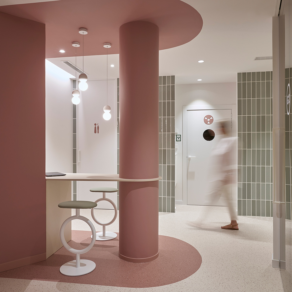
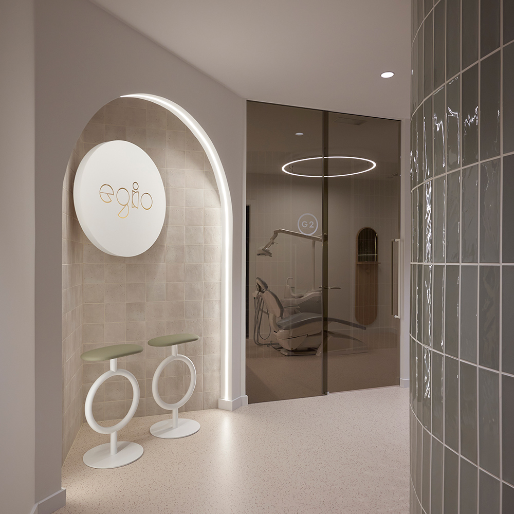
Egio Clinic
In this dental clinic, the design is based on creating an environment that promotes well-being by connecting users to a friendly environment. The organic shapes, the natural tones connect with a state of calm and balance. Totem is dressed in calm colours, with a white base and a moss green seat. A project by Estudio Vitale.
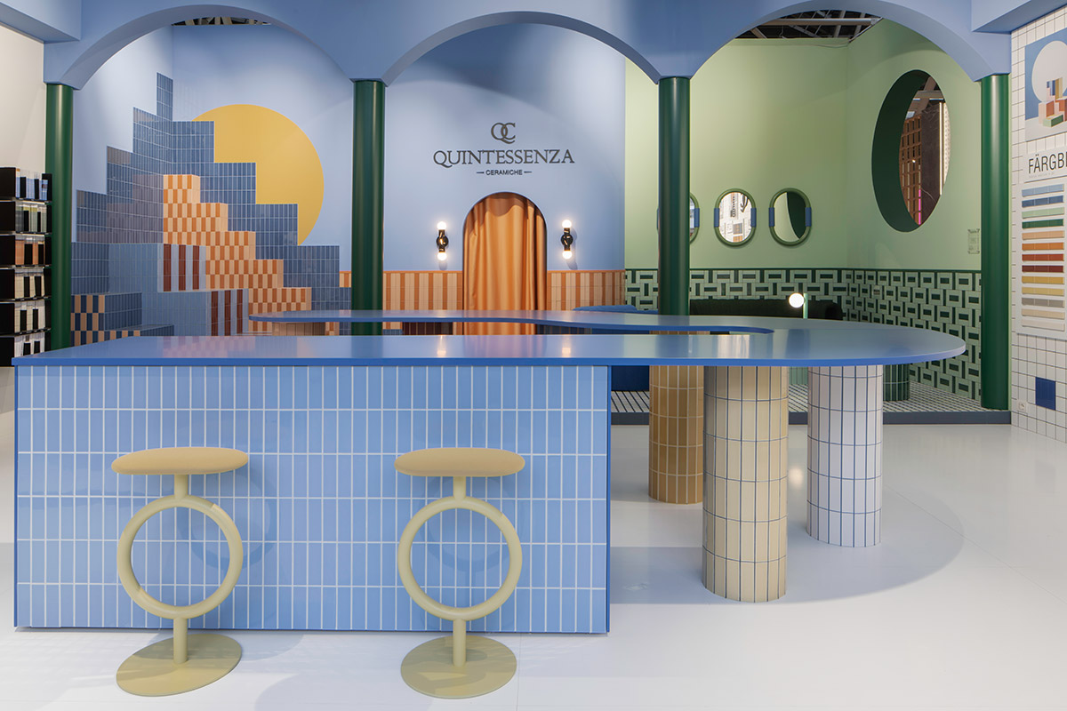
Quintessenza Ceramiche stand.
Colours, shapes and textures were combined in an ephemeral architecture project by architect and colourist Teklan. Her particular way of understanding spaces materialised in a stand that combined the linearity of Quintessenza Ceramiche tiles with the soft curved shapes of Totem. Here you can see more images of their stand.
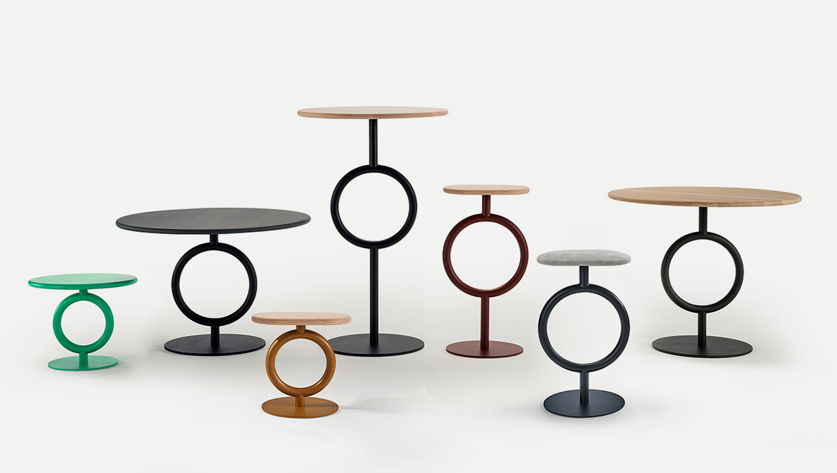
The original stool, with two heights, has already been joined by a large family of tables and small tables together with a low stool, a smaller seating option, ideal for tea or lounge tables.
Do you want to include Totem in your projects? Download here the Bim Revit files, 3D, 2D and technical data sheets.


